top of page
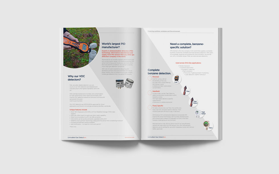
Ion are one of the largest manufacturers that design and create gas sensors and instruments for a wide range of industries and applications. They wanted to rebrand. Their old brand was very dated so they wanted a new modern look, but something that didn't drift too far from what they had originally. Their previous brand had been produced over 20 years ago and hadn't been updated since, so taking elements from the previous design we lifted the brand by updating the colours and the typography, but still trying to keep the scientific feel present.

bottom of page


